The Don John is a local pub to a very old mining village called Maltby. The pub has been around for a very long time. It has had many owners over the years and with each owner it has had a mini re-brand every time. This time the new owners wanted to freshen up and add to their social media.
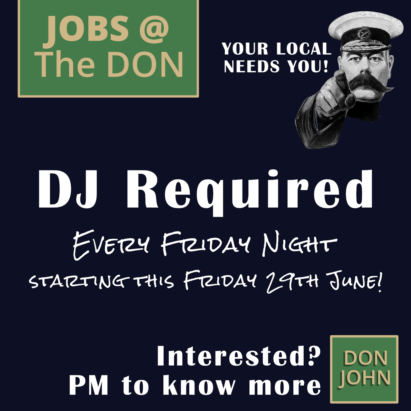
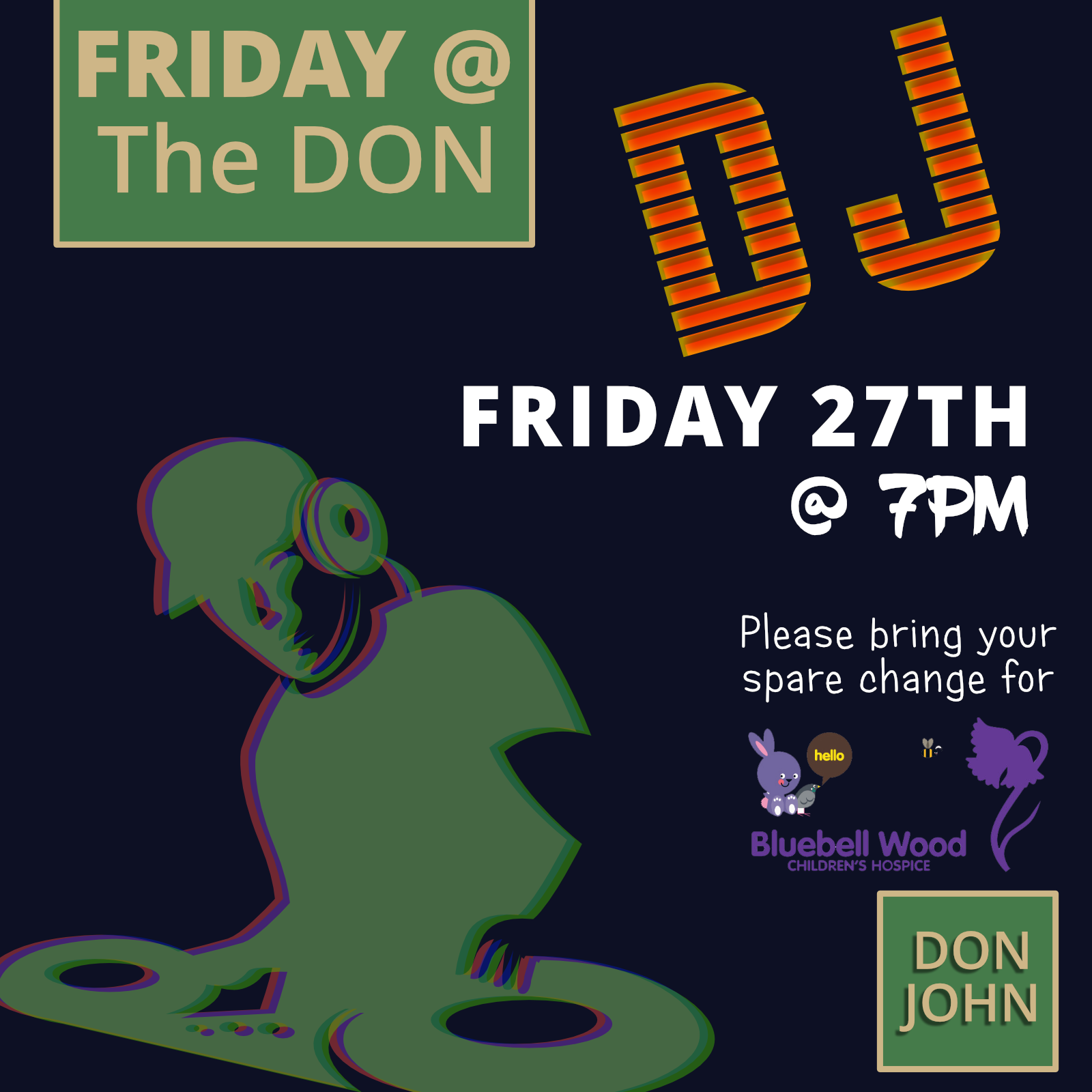
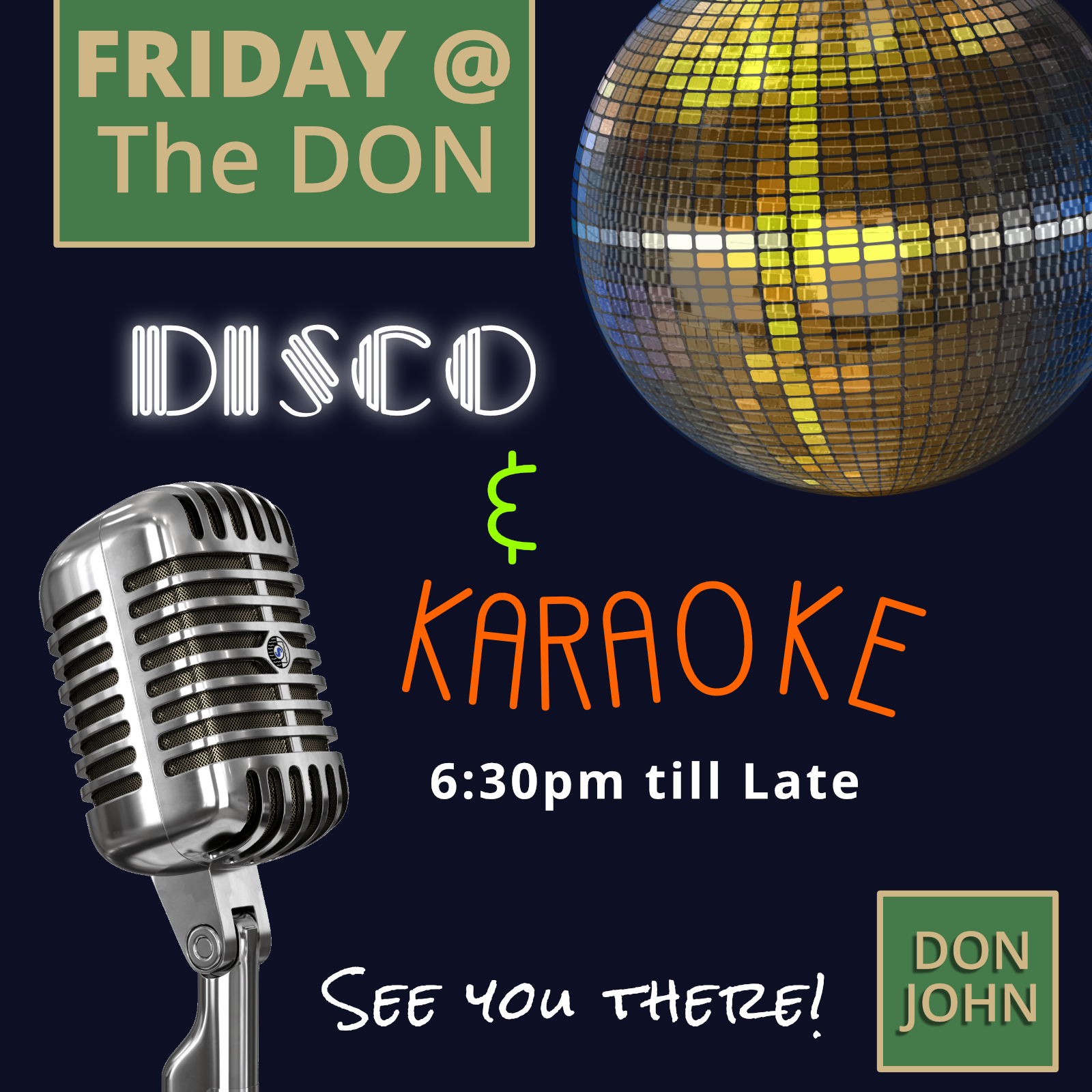
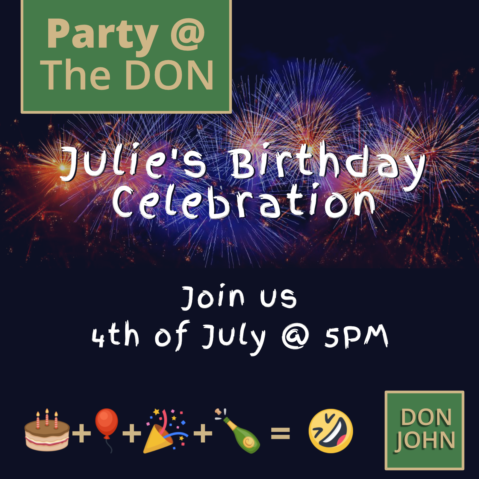
A series of Facebook posts were made along with the logo, the colours and overall design language of how their posts should look like.
We started with @ The Don - the locals refer the the Don John pub as just The Don and often hear them say "we're at The Don". So to reinforce this and the brand locally, I created the Jobs @ The DON, Friday @ The DON etc etc.
Appealing to younger members of the public to break the stigma of pubs are for old people, we introduced small things like, emoticons and the @ symbol which is more universally known to millennials.
The dark background allows the green and gold to stand out more on the background. We have used various typefaces on different posts mostly relating to what the post is about.